Size
In context


About Close Encounters of the Third Kind
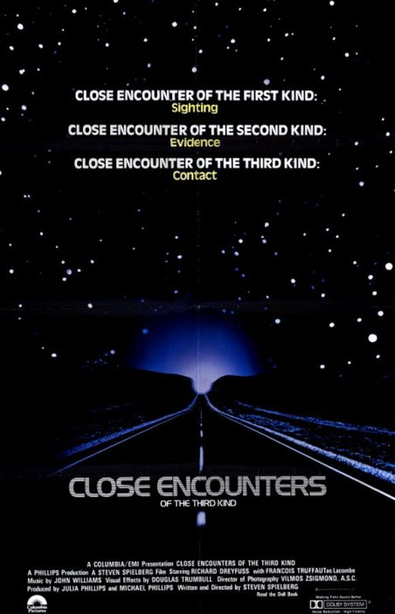
Close Encounters of the Third Kind is Steven Spielberg's 1977 science-fiction landmark about an everyman drawn toward a government-concealed UFO contact event, capped by the famous five-note communication with an alien craft. A critical and commercial milestone for Columbia Pictures, the film paired the glow of its mountain-and-lights imagery with a clean, wide sans-serif title treatment that felt modern and otherworldly at once.
The film helped define the visual language of the late-1970s UFO and first-contact genre, and its understated, luminous poster design has been referenced for decades. The title lettering reads as calm and futuristic rather than pulpy, a wide low-contrast sans that let the imagery carry the wonder. That clean, open, wide-sans feel is what this font recreates.
What font does Close Encounters of the Third Kind use?
Close Encounters of the Third Kind uses The Close Encounters title is a wide, clean sans-serif most often matched with Handel Gothic; this page's style draws on the humanist Antique Olive register (Roger Excoffon, 1962), the wide low-contrast sans used as the reference here. Both are commercial typefaces, and the font on this page is Lipi's original generated lookalike of that wide-sans style.
On this page, Lipi offers a generated lookalike of the font used in Close Encounters of the Third Kind — ready to download instantly with a commercial license, no third-party purchase required.
Where this style works
Clean, wide humanist sans-serifs in this register work for science-fiction and tech branding, film and documentary title cards, museum and planetarium identity, editorial headlines, and any layout that wants an open, optimistic, mid-century-modern feel. The generous proportions and even strokes give wordmarks a calm authority that reads well at poster scale.
What you get
Instant download as OTF, TTF and WOFF, with a commercial-use license for $7.99.
Full diacritic coverage for 81 Latin-script languages
English, Spanish, Indonesian, Portuguese, Swahili, German, Turkish, Filipino, Italian, Polish, Oromo, Uzbek (Latin), Zulu, Dutch, Somali, Malagasy, Afrikaans, Shona, Hungarian, Rundi, Kinyarwanda, Czech, Swedish, Serbian, Quechua, Albanian, Croatian, Luyia, Luo, Danish, Finnish, Slovak, Ganda, Sango, Norwegian Bokmål, Kalenjin, North Ndebele, Swiss German, Bemba, Nyankole, Soga, Teso, Lithuanian, Gusii, Galician, Sena, Slovenian, Chiga, Irish, Makonde, Morisyen, Estonian, Kabuverdianu, Basque, Norwegian Nynorsk, Friulian, Shambala, Bena, Asu, Luxembourgish, Icelandic, Jola-Fonyi, Taita, Samburu, Machame, Colognian, Breton, Vunjo, Makhuwa-Meetto, Rwa, Rombo, Sangu, Faroese, Romansh, Scottish Gaelic, Upper Sorbian, Lower Sorbian, Manx, Inari Sami, Volapük, Cornish.
Not affiliated with or endorsed by the rights holders of Close Encounters of the Third Kind. The font on this page is an original Lipi-generated lookalike of the font used in Close Encounters of the Third Kind, not a redistribution of the original commercial typeface. For the original typeface, see the official source.
Frequently asked questions
What font does Close Encounters of the Third Kind use?
The title lettering is a wide, clean sans-serif; designers most often approximate it with Handel Gothic, while the humanist Antique Olive sits in the same wide low-contrast family and is the reference behind this page. Both are commercial typefaces. Lipi's version is an original generated lookalike of that wide-sans style.
What fonts are similar to this style?
Wide, clean sans-serifs in the same family of look include Handel Gothic, Antique Olive, Eurostile, Microgramma, and Bank Gothic. Free options in adjacent territory include Jost and Questrial via Google Fonts.
Can I use this font in commercial work?
Yes. The Lipi license covers commercial use including branding, film and broadcast graphics, marketing, and client work, with no per-seat or per-impression caps. The only restriction is redistributing or reselling the font file itself.
Close Encounters of the Third Kind Font: Grove Tract
Lipi-generated lookalike of the font used in Close Encounters of the Third Kind. 81 languages with full diacritic coverage, one commercial license.
What you get
- ✓ OTF, TTF & WOFF files
- ✓ Commercial use license
- ✓ Personalised license PDF
- ✗ Resale or redistribution
Not affiliated with or endorsed by any brand referenced. Names are used descriptively to identify lettering style.
More movies-tv fonts
Other famous movies-tv fonts on Lipi.ai.