Size
In context


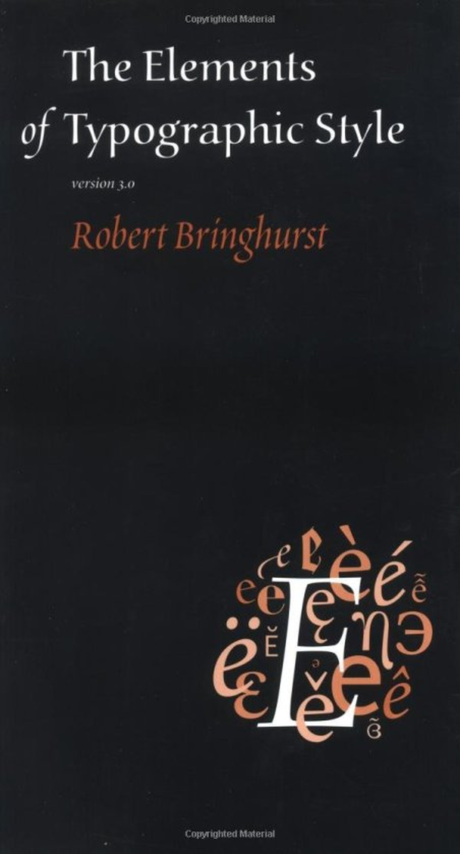
About The Elements of Typographic Style
Across the interior of The Elements of Typographic Style, Robert Bringhurst leans on a Venetian-italic display cut to mark pull-quotes, captions, and section openers — letterforms with cursive grace and sturdy proportions. That italic display companion gives the book its scholarly cadence and is widely echoed in classical book design today.
The italic display weight isn't just the regular face slanted: it's drawn separately with chancery-style entry and exit strokes, calligraphic swashes, and a softer terminal treatment that signals "this is a considered moment, not body copy." That distinction is part of why Bringhurst's book itself is held up as an example of how italics should earn their keep on a page.
What font does The Elements of Typographic Style use?
The Elements of Typographic Style uses Arno Pro Italic Display by Robert Slimbach for Adobe (2007), the italic companion to the Arno Pro family. A commercial release from Adobe.
On this page, Lipi offers a generated lookalike of the font used in The Elements of Typographic Style — ready to download instantly with a commercial license, no third-party purchase required.
Where this style works
Italic Venetian display faces shine in callouts, pull-quotes, captions, chapter epigraphs, recipe-book introductions, and any setting where a designer wants to mark a moment of cursive emphasis without breaking the typographic register. They're also a strong choice for wedding stationery, literary-magazine flag treatments, and luxury-brand tagline lockups that need both elegance and editorial discipline.
What you get
Instant download as OTF, TTF and WOFF, with a commercial-use license for $7.99.
Full diacritic coverage for 81 Latin-script languages
English, Spanish, Indonesian, Portuguese, Swahili, German, Turkish, Filipino, Italian, Polish, Oromo, Uzbek (Latin), Zulu, Dutch, Somali, Malagasy, Afrikaans, Shona, Hungarian, Rundi, Kinyarwanda, Czech, Swedish, Serbian, Quechua, Albanian, Croatian, Luyia, Luo, Danish, Finnish, Slovak, Ganda, Sango, Norwegian Bokmål, Kalenjin, North Ndebele, Swiss German, Bemba, Nyankole, Soga, Teso, Lithuanian, Gusii, Galician, Sena, Slovenian, Chiga, Irish, Makonde, Morisyen, Estonian, Kabuverdianu, Basque, Norwegian Nynorsk, Friulian, Shambala, Bena, Asu, Luxembourgish, Icelandic, Jola-Fonyi, Taita, Samburu, Machame, Colognian, Breton, Vunjo, Makhuwa-Meetto, Rwa, Rombo, Sangu, Faroese, Romansh, Scottish Gaelic, Upper Sorbian, Lower Sorbian, Manx, Inari Sami, Volapük, Cornish.
Not affiliated with or endorsed by the rights holders of The Elements of Typographic Style. The font on this page is an original Lipi-generated lookalike of the font used in The Elements of Typographic Style, not a redistribution of the original commercial typeface. For the original typeface, see the official source.
Frequently asked questions
Is this italic Venetian font free?
No. Arno Pro Italic Display is a commercial Adobe typeface. The Lipi lookalike here is sold under a single $7.99 commercial license for designers who want the same italic register without a separate foundry purchase.
What fonts are similar to Arno Pro Italic Display?
Italic display cuts in the same Venetian or Garalde families include Adobe Jenson Pro Italic Display, Brioso Pro Italic Display, Cala Italic, and ITC Galliard Italic. Most are commercial; free near-substitutes include EB Garamond Italic and Cormorant Italic from Google Fonts.
What is this italic font best used for?
Pull-quotes, callouts, recipe-book intros, literary-magazine flag treatments, wedding stationery, museum captions, and anywhere a designer wants italics to read as a deliberate editorial choice rather than mere emphasis.
The Elements of Typographic Style Font: Meteor Clash
Lipi-generated lookalike of the font used in The Elements of Typographic Style. 81 languages with full diacritic coverage, one commercial license.
What you get
- ✓ OTF, TTF & WOFF files
- ✓ Commercial use license
- ✓ Personalised license PDF
- ✗ Resale or redistribution
Not affiliated with or endorsed by any brand referenced. Names are used descriptively to identify lettering style.
More books fonts
Other famous books fonts on Lipi.ai.