Size
In context


About The Elements of Typographic Style
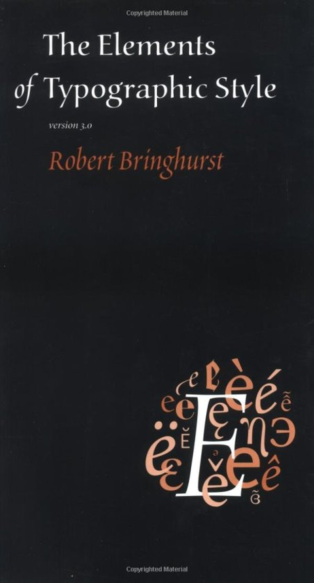
The Elements of Typographic Style is Robert Bringhurst's canonical 1992 manual on typography and book design — required reading at type programmes worldwide and now in its fourth edition. The cover and chapter openers use a refined Venetian Old Style display face, the kind of typography the book itself argues for: serene, scholarly, designed to be read at long passages without strain.
Bringhurst's book has shaped how a generation of designers thinks about rhythm, proportion, and the moral seriousness of setting type — Hartley & Marks have kept it in print for over three decades and continued to refine the interior design with each edition. The display lockup on the cover has become a quiet signal in design circles for "this is a book that respects its reader."
What font does The Elements of Typographic Style use?
The Elements of Typographic Style uses Arno Pro Display, designed by Robert Slimbach for Adobe (2007). A commercial Venetian Old Style optimised for large display sizes.
On this page, Lipi offers a generated lookalike of the font used in The Elements of Typographic Style — ready to download instantly with a commercial license, no third-party purchase required.
Where this style works
Venetian display faces like this are the right pick when content needs to carry intellectual weight: book covers, scholarly journals, museum wayfinding, prestige magazines, foundation reports, classical music programs, and brand identities for arts institutions. The calligraphic underpinnings give chapter titles and section openers a quiet authority that modernist faces struggle to match, while the display optical sizing keeps the letterforms crisp at poster-scale.
What you get
Instant download as OTF, TTF and WOFF, with a commercial-use license for $7.99.
Full diacritic coverage for 81 Latin-script languages
English, Spanish, Indonesian, Portuguese, Swahili, German, Turkish, Filipino, Italian, Polish, Oromo, Uzbek (Latin), Zulu, Dutch, Somali, Malagasy, Afrikaans, Shona, Hungarian, Rundi, Kinyarwanda, Czech, Swedish, Serbian, Quechua, Albanian, Croatian, Luyia, Luo, Danish, Finnish, Slovak, Ganda, Sango, Norwegian Bokmål, Kalenjin, North Ndebele, Swiss German, Bemba, Nyankole, Soga, Teso, Lithuanian, Gusii, Galician, Sena, Slovenian, Chiga, Irish, Makonde, Morisyen, Estonian, Kabuverdianu, Basque, Norwegian Nynorsk, Friulian, Shambala, Bena, Asu, Luxembourgish, Icelandic, Jola-Fonyi, Taita, Samburu, Machame, Colognian, Breton, Vunjo, Makhuwa-Meetto, Rwa, Rombo, Sangu, Faroese, Romansh, Scottish Gaelic, Upper Sorbian, Lower Sorbian, Manx, Inari Sami, Volapük, Cornish.
Not affiliated with or endorsed by the rights holders of The Elements of Typographic Style. The font on this page is an original Lipi-generated lookalike of the font used in The Elements of Typographic Style, not a redistribution of the original commercial typeface. For the original typeface, see the official source.
Frequently asked questions
Is the Elements of Typographic Style font free?
No. The book uses Arno Pro Display, a commercial Adobe typeface available through Adobe Fonts subscription. The Lipi lookalike on this page is sold under a single $7.99 commercial license for designers who want the same scholarly Venetian feel without a subscription.
What fonts are similar to Arno Pro Display?
Other Venetian Old Style display faces with comparable warmth include Adobe Jenson Pro Display, Centaur, Cala, Brioso Pro, Adobe Caslon Pro, and Sabon Next. Free options in adjacent categories include EB Garamond and Cormorant Garamond from Google Fonts.
What is this font best used for?
Book covers, academic journals, museum and gallery identity, premium editorial design, classical music programs, and any long-form publication where readability and visual gravitas both matter. The display optical sizing makes it especially strong at chapter-opener and poster scales.
The Elements of Typographic Style Font: Sigil Crash
Lipi-generated lookalike of the font used in The Elements of Typographic Style. 81 languages with full diacritic coverage, one commercial license.
What you get
- ✓ OTF, TTF & WOFF files
- ✓ Commercial use license
- ✓ Personalised license PDF
- ✗ Resale or redistribution
Not affiliated with or endorsed by any brand referenced. Names are used descriptively to identify lettering style.
More books fonts
Other famous books fonts on Lipi.ai.