What Font Does Spotify Use? The Ten-Year Journey from Circular to Spotify Sans
Spotify spent five years renting one of the most popular geometric sans-serifs on the market. Then, in 2018, they quietly built their own. The story of Spotify Sans is about what happens when a brand grows so large that licensing somebody else's typography becomes a permanent line item, and ownership becomes the only sane long-term move.
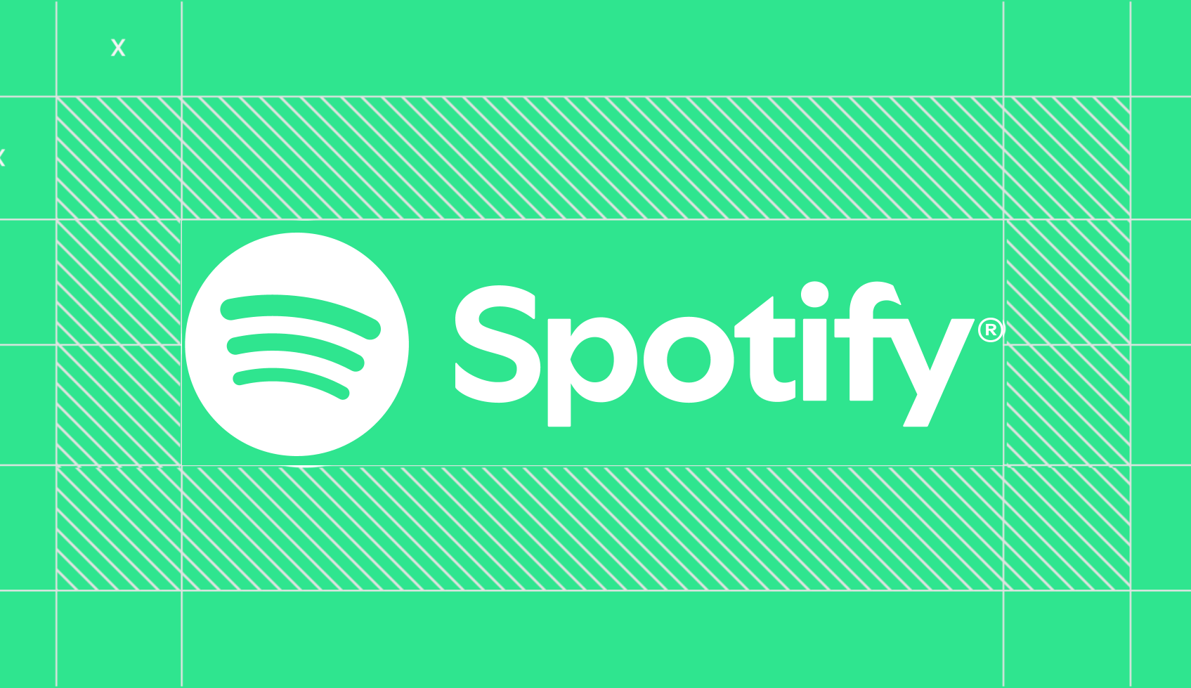
There is a font you have seen on every album cover, every podcast thumbnail, every Liked Songs notification, and every Made For You recommendation card for the last decade. It is the font that tells you a song is about to start, the artist's name is appearing in the corner, and your weekly rewind is ready. It is the font of background listening, gym workouts, sad sleeper-train moments, and the particular feeling of opening Spotify on a Sunday morning to find the algorithm has read your mood disturbingly well.
The font is called Spotify Sans, and the story of how it came to exist is less about typography than it is about money, brand identity, and the very specific moment in 2018 when Spotify decided that paying somebody else's license fees forever was no longer an option.
But Spotify Sans is not actually the first font that defined Spotify. To understand why they built their own, you have to start with the one they spent five years renting.
The Circular Era
Before Spotify Sans, there was Circular.
Circular Std is a typeface designed by Laurenz Brunner and published by Lineto, a small Swiss type foundry. Brunner started designing Circular in the early 2010s as a contemporary geometric sans, taking influence from older designs like Futura and Avenir but with subtle warmth in the curves and a more comfortable feel at body-text sizes. The font was released by Lineto in 2013.
Spotify adopted Circular almost immediately. By the mid-2010s, it had become the foundation of Spotify's visual identity: every album page, every search bar, every menu item, every push notification. Circular was Spotify, and Spotify was Circular. The relationship was so total that users started associating the typeface with the brand even when they could not name what they were looking at.
This is exactly the result type designers hope for. It also turns out to be the result that gets very expensive, very fast, when your platform crosses 200 million users.
Why Spotify Built Spotify Sans
The same dynamics that pushed Netflix to build Netflix Sans were quietly pushing Spotify in the same direction. Font licensing scales with usage. A small startup pays a flat fee for a desktop license and ships their product. A platform with hundreds of millions of monthly users across web, iOS, Android, embedded car systems, smart TVs, smart speakers, voice interfaces, podcast players, and a steadily expanding constellation of integrations does not pay flat fees. It pays per platform, per usage tier, per region, per impression in some agreements.
Spotify has never publicly disclosed what they were paying Lineto for Circular at the company's peak adoption, and Lineto is too small a foundry to file public statements about it. But based on similar disclosures from other large tech companies, the annual cost of licensing a typeface as comprehensively as Spotify was using Circular runs into the high six figures.
There was also a strategic problem. Circular, like Gotham, was popular. Other companies were licensing it. The visual identity Spotify had built around Circular was not exclusively theirs, even though they had used it more aggressively and consistently than almost anyone else. There was a non-trivial chance that a competitor or an adjacent service would pick up Circular and accidentally borrow some of the brand recognition Spotify had spent years building.
The solution was custom. In 2018, Spotify commissioned a new typeface that would belong to them alone, designed for the specific demands of their interface, their marketing, and their global script coverage. The result was Spotify Sans.
The brief was harder than it sounds. They needed something that felt like a continuation of the Circular era so longtime users would not experience whiplash. They needed something that worked at every size from a mobile notification badge to a billboard. They needed something that scaled across Latin, Cyrillic, Greek, and dozens of other writing systems for Spotify's global markets. And they needed something that would feel as ambient and friendly as Circular did, without being mistaken for it.
What Spotify Sans Does Differently
Spotify Sans landed in 2018, rolling out gradually across the product over the following year. To a casual eye it looks similar to Circular: clean, geometric, friendly, with rounded contours and open counters. The differences are subtle but deliberate.
The most visible change is in the lowercase letters. Spotify Sans has slightly more humanist proportions than Circular. The 'a', 'e', and 'g' have more curvature in their bowls, lending the font a warmer feel that reads better at the small interface sizes where most Spotify text actually lives. The strokes are slightly more contrasted, with more weight variation through the letterforms, which gives the font a touch more visual rhythm at body sizes.
The numerals are designed for use in chart positions, song durations, and timestamps, all places where Spotify uses numerals constantly. They are tabular and hold their alignment cleanly in vertical lists, which is the kind of detail that nobody notices when it is right and that everybody notices when it is wrong.
Most importantly, Spotify Sans was built from the start as a multi-script family, with proper coverage of Latin, Greek, and Cyrillic scripts. The design respects the distinct conventions of each writing system rather than forcing them into Latin proportions, which is a costly choice in design hours but the kind of decision you can only make when you own the font outright.
The Wordmark Is a Different Thing
Here is where people get confused. Spotify Sans is the typeface used for almost all of the text inside the Spotify product: artist names, album titles, playlist headers, queue entries, settings menus, push notifications, marketing emails, in-app banners, search results. But the SPOTIFY wordmark itself, the green word that appears in the app icon and on splash screens, uses a different and earlier custom letterform.
The wordmark predates Spotify Sans by nearly a decade. It was developed during the company's early branding work, and it is technically not a typeface at all. It is a custom-drawn logotype, six letterforms designed once to be used together as the Spotify mark. It is not part of the Spotify Sans family, you cannot type with it, and there is no font file for it that exists anywhere outside of Spotify's brand assets folder.
If you are trying to recreate Spotify's visual identity, this distinction matters. Grabbing a font that looks like Spotify Sans gets you most of the way there for body text, but the wordmark needs its own treatment. Trying to type the word 'Spotify' in Spotify Sans will produce a result that any longtime Spotify user will subconsciously notice as wrong, even if they cannot articulate why.
The Evolution Since 2018
Spotify's visual identity has continued to refine itself in the years since Spotify Sans first rolled out. The brand team has updated the typeface at the margins, tightened spacing in some weights, added new display variants for editorial moments inside the product, and built a typographic system that scales from interface chrome to brand-led marketing campaigns.
Most users will never consciously notice these refinements. They show up as a slightly tighter Wrapped page one year, a slightly larger podcast cover headline the next, a slightly different feel to the campaign artwork that announces a new product feature. The cumulative effect over five years has been a visual identity that is unmistakably Spotify, end to end, in a way that very few competitors at any size can match.
This is the kind of typographic system you can only build when you own your typefaces. Renting fonts means renting the boundaries of what you can do with them. Owning them means you can keep adding new family members, new weights, new scripts, new display variants for new product surfaces, indefinitely, without going back to a foundry to renegotiate.
Finding the Spotify Font in the Wild
If you have ever taken a screenshot of a Spotify interface and wondered what font is in it, you are in good company. Spotify Sans is recognizable once you know what you are looking for, but it is similar enough to Circular and a dozen other geometric sans-serifs that telling them apart by eye is harder than it sounds.
Tools like Lipi.ai's deep-matcher can analyze an uploaded image and identify the fonts used in it, including when multiple typefaces appear in the same frame. Upload a Spotify screenshot and it will distinguish between the wordmark treatment, any display typography in promotional cards, and the Spotify Sans body text that handles the actual interface. For designers working in adjacent visual registers, or trying to figure out why their work feels close to Spotify but not quite right, this kind of identification cuts out a lot of trial and error.
For people who want to use a similar style without the actual Spotify font, the options are reasonably plentiful. Inter, Satoshi, and General Sans get into the right neighborhood, all available with various commercial licensing terms. Circular Std itself is still available from Lineto for projects that have the budget and want the original article. None of them will perfectly match Spotify Sans, because Spotify Sans is not for sale at any price.
What Spotify Teaches About Brand Typography
The Spotify story is a variation on the same story as Netflix, just at a different scale and with a different specific shape. A successful company licenses a great typeface, becomes synonymous with it, hits the licensing wall, and decides that owning their typography is a permanent improvement to how they operate.
The pattern is not a coincidence. Every company that grows past a certain size and uses a font in a sufficiently visible way eventually faces the same calculation: ongoing license fees forever, or a one-time investment in something that belongs to them. The math always favors building, eventually.
What has changed in the last few years is that the threshold for 'you should consider building your own font' has dropped. Custom font commissions used to start in the high five figures and run into the hundreds of thousands of dollars for a full multi-script family. AI font generation tools mean a brand or a solo designer can describe the visual register they want, the feeling they want their typography to convey, and get a font that is theirs. It does not take a year. It does not require a six-figure budget. It does not require commissioning a foundry on the other side of the world.
The economics that pushed Spotify to build Spotify Sans in 2018 now apply to a company a thousand times smaller than Spotify was at the time. The font you use is either building your brand or somebody else's. Spotify made the call early, when the only path was a large investment with a long timeline. The same call today takes hours, not years.
That does not mean every brand should build their own font. It does mean every brand can, which is a meaningfully different world than the one Spotify was operating in seven years ago.