What Font Does Netflix Use? The Story Behind a $1 Billion Typography Decision
Netflix didn't just pick a font. They fired one, paid a fortune for years, then quietly built their own. The story of Netflix Sans is about money, brand control, and why the typeface on your screen right now was engineered to feel like cinema.
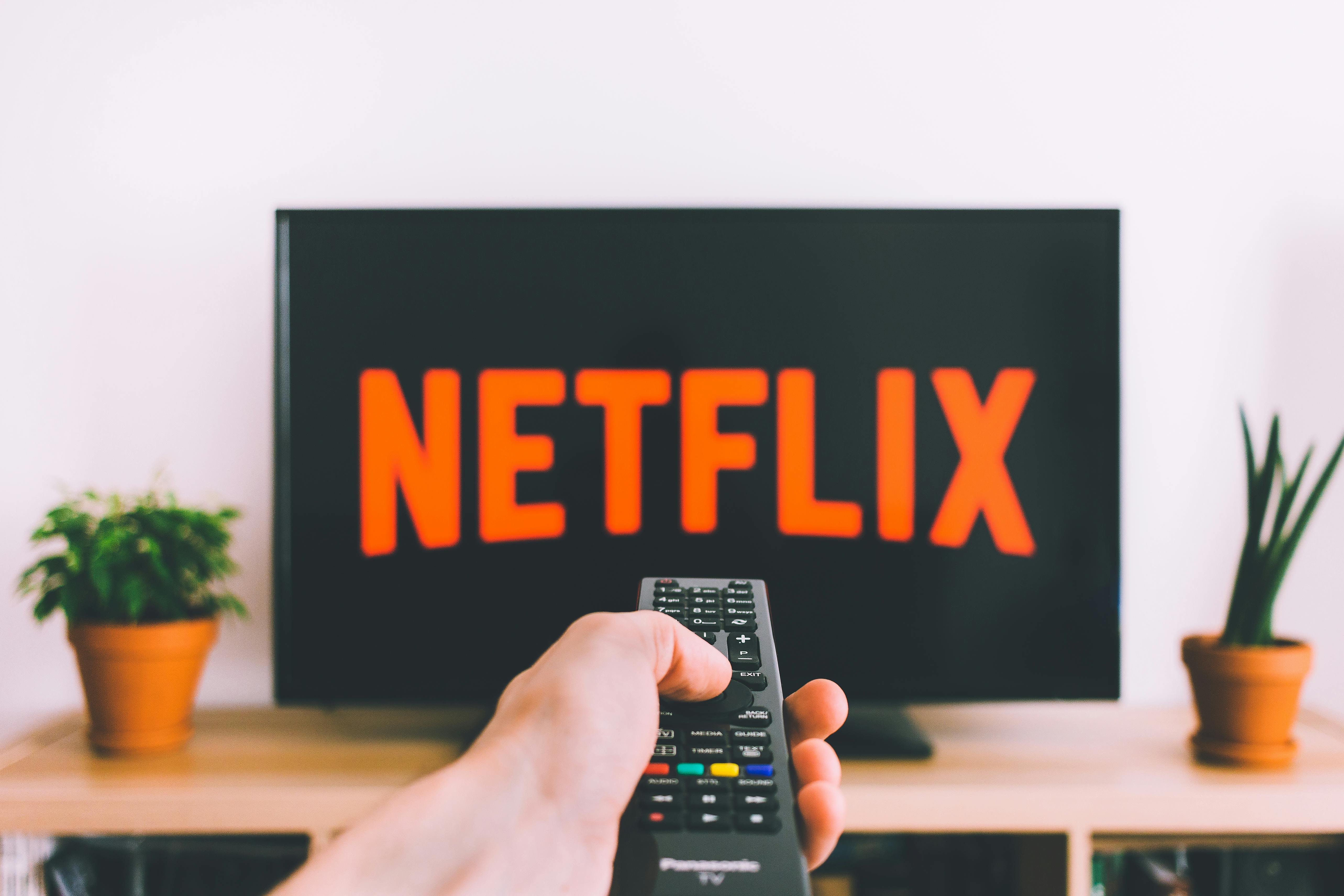
There is a font you have seen thousands of times and never thought about. It lives on the world's most-watched streaming platform, on billboards in 40 countries, in show titles, menu buttons, subtitle text, and the little label that tells you something new is releasing on Friday. You have read millions of words in this font without registering it exists.
That is exactly how Netflix designed it.
The typeface is called Netflix Sans, and the story of how it came to exist is not really a typography story. It is a story about money, control, and what happens when a company becomes large enough that even the fonts it licenses start costing more than most people make in a lifetime.
Netflix Used to Pay Someone Else's Rent
For years, Netflix used Gotham. If you are not a designer, you might not recognize the name, but you have definitely seen the face. Gotham is the font that Barack Obama's 2008 campaign put on every poster, yard sign, and television graphic. It is the font carved into the concrete of One World Trade Center. It is the font that shows up in so many corporate rebrands that designers started calling it "the safe choice," which is a compliment dressed up as an insult.
Gotham was designed by Tobias Frere-Jones at Hoefler and Co., released in 2000, and it became one of the most licensed typefaces in the world almost immediately. The design is based on the lettering found on 1950s American buildings, those big clean geometric letters above hardware stores and parking garages in midtown Manhattan. Frere-Jones called it an "American vernacular" font, meaning it looked like nobody designed it at all. It looked like it had always been there.
Netflix loved Gotham for exactly that reason. It felt authoritative without feeling stuffy. It worked at huge sizes on billboards and at tiny sizes on mobile screens. It conveyed the message Netflix wanted to convey in 2011 and 2012 and 2013: we are serious, we are modern, we belong here.
The problem was scale.
Font licensing is not like buying software. You do not pay once and own it. You pay based on usage: how many desktop installations, how many website visitors, how many apps, how many digital platforms. For a startup, these costs are manageable. For Netflix, which was operating in over 190 countries by 2016 with hundreds of millions of active accounts across every device category imaginable, the licensing fees for a single typeface were reportedly becoming significant enough to appear as a line item that executives actually discussed.
The exact number has never been publicly disclosed. Netflix is not in the habit of publishing its font budget. But in interviews, Netflix brand design lead Noah Nathan described the cost situation as a key driver for building something custom. "Escalating costs" was the phrase he used. The decision was, at its core, a financial one.
Which is a deeply unsexy origin story for something people find beautiful.
Hiring a Foundry to Build a Font From Scratch
In 2017, Netflix approached Dalton Maag, a London-based type design studio that has built custom typefaces for Amazon, Nokia, and the BBC, among others. The brief was not simply "make us a font that looks like Gotham but different enough that we do not have to pay for Gotham." That would have produced something generic and hollow.
The brief was more interesting than that.
Netflix wanted a typeface that felt like it belonged to cinema. They wanted something that captured the particular quality of watching a title card appear over a wide shot before a film begins, that mix of anticipation and scale. They also wanted something that could work at eight pixels in an app interface and at eight feet on a physical storefront. Those two requirements are genuinely in tension with each other, and solving that tension is most of what makes type design hard.
The team working on Netflix Sans was led by Noah Nathan and Tanya Kumar internally, with Andre do Amaral and David Gallego at Dalton Maag handling the actual type design work. What they landed on uses what designers call "geometric humanist" proportions, which is a way of saying the letterforms are built on clean geometric shapes (circles, straight lines, consistent angles) but softened with the kind of slight irregularities that make text feel human rather than mechanical.
The uppercase letters were specifically designed to have what the team called "cinematic" proportions, which in practice means they are slightly wider and more open than a strictly utilitarian font would require. Wide letters catch the eye. They feel like titles, not footnotes. When you see STRANGER THINGS or THE CROWN rendered large, the uppercase spacing is doing real emotional work, making something that exists on a rectangle of glass feel like it belongs on a forty-foot screen.
The lowercase letters took the opposite approach. They are compact and efficient, optimized for the small sizes where most of the actual interface text lives. Reading "New Episodes Available" on your phone requires different letter proportions than reading the same words on a cinema poster.
The font also carries what the designers described as a "cinemascopic curve," a subtle reference to the curves in the Netflix logo's letterforms. It is the kind of detail that nobody consciously notices but that creates a coherence across everything the brand does, a sense that the font and the logo grew from the same root.
What Makes Netflix Sans Work
If you want to understand why Netflix Sans functions as well as it does, it helps to look at what it replaced and why Gotham was starting to feel like a liability.
Gotham is a great font. That is genuinely not in dispute. But greatness in typography does not mean exclusivity. By 2017, Gotham was everywhere. Political campaigns, corporate annual reports, startup pitch decks, real estate listings, gym membership brochures. When you use a font that ubiquitous, you are borrowing other brands' associations every time someone reads your words. The trust someone feels reading a serious political candidate's materials gets transferred, in tiny amounts, to your streaming service. But so does the distrust they feel reading a sketchy real estate developer's marketing copy.
Custom typefaces solve this. When your font exists nowhere else in the world, every association it builds belongs to you. Netflix Sans is now inseparable from the Netflix experience. That font means streaming. It means Friday release dates and autoplay previews and the particular ambient anxiety of a cliffhanger episode ending. No other brand shares those associations, because no other brand can use that font.
This is why companies with the resources to do it almost always end up going custom eventually. Apple has San Francisco. Google has Product Sans. IBM has Plex. The BBC has Reith. These are not vanity projects. They are infrastructure.
For Netflix, the custom typeface also solved a practical global problem. Gotham was designed for Latin scripts, and Netflix operates across dozens of script systems including Arabic, Hebrew, Japanese, Korean, Thai, and dozens more. Every time Netflix needed to display text in a non-Latin script while using Gotham for Latin text, there was a jarring inconsistency. The geometric weight and spacing of one script would feel completely different from the others.
Netflix Sans was designed from the start as a global typeface, with attention paid to how it would harmonize with the non-Latin scripts Netflix was using in those markets. This is expensive and time-consuming work, and it is the kind of thing you cannot do when you are licensing someone else's font.
The Logo Is a Different Story
Here is where people often get confused. Netflix Sans is the typeface Netflix uses for interface text, marketing copy, subtitles, and most of the text you see when you are actually using the product. But the NETFLIX wordmark itself, the red stacked letters in the app icon and on screen before content starts, uses a different and older treatment.
The wordmark has been through multiple iterations. The current version, introduced alongside the broader rebrand in 2018 that included Netflix Sans, is based on a custom-drawn serif-influenced design that predates the broader typeface work. It is not a font you can download or identify through a font-matching tool, because it was drawn as a logo, not designed as a repeatable typeface system.
If you are trying to recreate the Netflix title card aesthetic and you grab a font that looks like Netflix Sans, you will get the body text right but miss the logo. That distinction matters if you are designing something that needs to feel genuinely Netflix-coded versus something that just lives in the same general visual neighborhood.
Finding Fonts in the Wild
One of the most common reasons people end up researching Netflix's font is that they saw something, a poster, a show title, a screenshot, and they wanted to know what typeface was used. The Netflix brand is consistent enough that Netflix Sans is recognizable once you know what you are looking for, but font identification from screenshots used to require either a trained eye or a lot of trial and error.
That process has gotten considerably easier. Tools like Lipi.ai's deep-matcher can analyze an uploaded image and identify the fonts used across an entire design in a single pass, including when multiple different typefaces appear in the same frame. Upload a screenshot of a Netflix interface and it will distinguish between the wordmark treatment, the show title typography, and the interface font. Upload a poster that uses a font you want to identify and it returns matches with commercial licensing information.
For designers trying to work in a similar visual register to Netflix's aesthetic, the useful information is not just what font Netflix uses but what category of font produces that effect. Netflix Sans is a geometric humanist sans-serif with cinematic proportions. The alternatives that get closest to that feeling include Neue Haas Grotesk, Aktiv Grotesk, and the earlier version of Gotham itself. None of them are identical, which is the point.
What Netflix Taught Every Brand About Typography
Netflix's move to a custom typeface in 2018 did not invent the idea of brand-owned typography. That idea is as old as corporate identity design. But it happened at a moment when a lot of companies were asking themselves the same questions Netflix had been asking, and the visibility of the project made the case in a way that a whitepaper from a consulting firm never could.
The argument was simple: you are renting your visual identity, and the landlord can raise the rates or evict you at any time. Building your own means the associations you earn are yours permanently.
For large companies, the cost of commissioning a custom typeface from a foundry like Dalton Maag is real but finite. For smaller operations, it used to be out of reach entirely. The gap between "license someone else's font" and "own your own" had no middle option.
That is changing. AI font generation tools can now produce original typefaces from a text description, meaning a founder or designer can describe the feeling they want, the visual register they are going for, the brand associations they want to build, and get a font that belongs to nobody else and can be licensed or owned outright. It is not the same as a two-year collaboration with Dalton Maag. But for the vast majority of use cases, it does not need to be.
Netflix spent years paying Hoefler and Co. to use Gotham before deciding to build something they owned. The decision point is different for every company, but the underlying logic is the same: the font you use is either building your brand or somebody else's.
Choose accordingly.