The Written Word: Tracing Typography's Ancient Origins to Digital Dominance
From ancient Mesopotamian cuneiform to modern variable fonts, discover the 5,000-year journey of typography and how the design of letters has shaped human civilization.
The story of typography begins not with Gutenberg's press or even medieval manuscripts, but in the dusty archaeological sites of ancient Mesopotamia. What we recognize today as fonts—those carefully designed sets of characters that give voice to our written words—emerged from humanity's most fundamental desire: to make permanent what was once ephemeral.
The journey from cuneiform impressions in wet clay to the thousands of digital typefaces available at our fingertips represents one of civilization's most profound technological evolutions. It is a story that spans millennia, crosses continents, and reflects the changing nature of human communication itself.
The Dawn of Written Communication
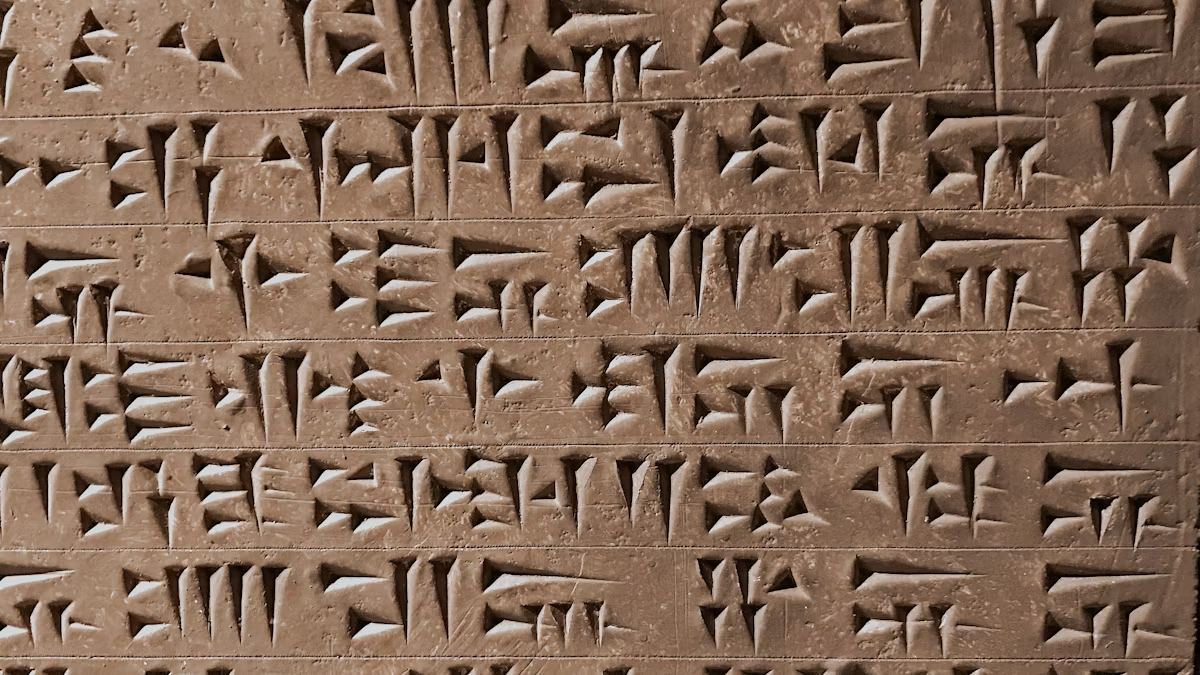
Around 3200 BCE, in the ancient city of Uruk in southern Mesopotamia, scribes developed what many scholars consider the world's first writing system. These early marks, pressed into clay tablets with wedge-shaped reeds, were primarily accounting tools—tracking grain harvests, livestock counts, and trade transactions. Yet within these utilitarian symbols lay the seeds of typography.
Cuneiform, as this writing system came to be known, represents our earliest example of standardized character design. Scribes had to ensure consistency across thousands of tablets, developing specific techniques for creating uniform wedge marks. The angle of the stylus, the pressure applied, and the sequence of strokes all became codified—the first typographic standards.
"What's remarkable about cuneiform is not just that it was first, but that it established principles we still follow today," notes Dr. Sarah Whitfield, a paleographer at Oxford University who specializes in ancient writing systems. "The idea of reproducible, standardized characters that maintain their meaning regardless of who writes them—that's the foundation of all typography."
The Egyptian Innovation
While Mesopotamians pressed wedges into clay, ancient Egyptians developed a radically different approach to writing. Hieroglyphics, emerging around 3100 BCE, introduced the concept of visual beauty into written communication. These weren't merely functional marks but artistic expressions that needed to maintain both aesthetic appeal and linguistic clarity.
The Egyptians gave us another crucial typographic innovation: the hieratic script. This simplified, cursive version of hieroglyphics was designed for everyday use on papyrus, demonstrating an early understanding that different contexts required different typographic solutions. Sacred texts demanded the formal beauty of hieroglyphics, while administrative documents needed the efficiency of hieratic writing.
This dual system presaged our modern distinction between display and text fonts—a conceptual framework that wouldn't be formally articulated for another four millennia.
The Alphabet Revolution
The Phoenicians, master traders of the ancient Mediterranean, revolutionized writing around 1050 BCE with their 22-letter alphabet. Unlike the complex syllabaries and logographic systems that preceded it, the Phoenician alphabet was ruthlessly efficient: one symbol, one sound.
This innovation spread rapidly through trade networks, adapted by Greeks who added vowels, then Romans who refined the letterforms into the capitals we still use today. The Roman inscriptional capitals, carved into monuments across their empire, established proportions and design principles that remain influential. The Trajan Column in Rome, completed in 113 CE, features lettering so perfectly balanced that it continues to inspire type designers.
Medieval Manuscripts and the Birth of Lowercase
The fall of Rome didn't end the evolution of typography—it accelerated it. In medieval scriptoriums across Europe, monks developed new writing styles to cope with the massive task of copying religious texts. The Carolingian minuscule, promoted by Charlemagne in the 8th century, introduced what we now call lowercase letters.
This period saw an explosion of regional styles: the compressed, angular Blackletter in Germany; the rounded Rotunda in Italy; the distinctive Insular script of Ireland and Britain. Each reflected local aesthetic preferences while serving the practical need for faster, more efficient writing.
Gutenberg's Revolution
Johannes Gutenberg's introduction of movable type to Europe around 1440 changed everything. His first challenge was creating a typeface that would be accepted by readers accustomed to handwritten manuscripts. His solution was brilliant: a Blackletter font that mimicked the formal book hands of his era, complete with multiple versions of each letter to simulate the natural variations in handwriting.
Gutenberg's technical innovations—the type mold, oil-based inks, and the printing press itself—were remarkable. But his typographic insight was equally important: he understood that successful typography must bridge technological capability with reader expectations.
The Renaissance and Typography's Golden Age
The printing press's spread through Europe triggered a typographic renaissance. In Venice, Nicolas Jenson created roman typefaces of unprecedented elegance around 1470. His designs influenced generations of type designers and established Venice as the center of typographic innovation.
Aldus Manutius, another Venetian printer, introduced italic type in 1501—not as a companion to roman type, but as a space-saving device for portable books. Francesco Griffo, his type designer, created letterforms that allowed more words per page without sacrificing readability, demonstrating how economic pressures could drive typographic innovation.
In France, Claude Garamond refined these Italian innovations in the 1540s, creating typefaces of such balance and readability that they remain popular today. The Garamond typefaces—there are many versions—represent perhaps the longest-lived design in typographic history.
The Industrial Revolution and Typography's Democratization
The Industrial Revolution transformed typography from craft to industry. The 19th century saw an explosion of new typefaces designed not for books but for advertising. Fat faces, slab serifs, and decorative display types proliferated, each competing for attention in an increasingly commercial world.
The period's most significant innovation might be the Linotype machine, invented by Ottmar Mergenthaler in 1884. By allowing operators to set entire lines of type using a keyboard, it made daily newspapers economically viable and accelerated the spread of literacy.
The Modern Movement
The early 20th century brought a radical rethinking of typographic principles. The Bauhaus school in Germany promoted functionalist design, stripping away ornament in favor of clarity. Paul Renner's Futura (1927) embodied these principles: geometric, efficient, modern.
In Switzerland, designers like Max Miedinger created Helvetica (1957), perhaps the most ubiquitous typeface of the modern era. Its neutral, almost invisible character made it perfect for the emerging international style of graphic design.
The Digital Revolution
The introduction of desktop publishing in the 1980s democratized typography once again. Suddenly, anyone with a computer could access professional-quality typefaces. Adobe's PostScript technology, introduced in 1984, made scalable digital fonts practical, while TrueType, developed by Apple and Microsoft, brought high-quality typography to the masses.
This democratization had profound effects. Type design, once the province of a few specialists, became accessible to anyone with font creation software. The result was an explosion of creativity—and controversy. By the early 2000s, tens of thousands of digital fonts were available, ranging from meticulous revivals of historical designs to experimental forms that would have been impossible with physical type.
The Unicode Era and Global Typography
Perhaps the most significant recent development in typography has been the Unicode standard, which aims to provide a unique number for every character in every writing system. First published in 1991, Unicode has grown to encompass over 140,000 characters covering 154 modern and historic scripts.
This technical standard has profound cultural implications. For the first time in history, typography can be truly global. A single font file can now contain Latin, Arabic, Chinese, and Devanagari characters, each respecting its unique design traditions while working harmoniously together.
Variable Fonts and the Future
The latest innovation in digital typography is the variable font format, standardized in 2016. Instead of separate files for different weights and styles, a variable font contains all variations within a single file, with axes that can be adjusted infinitely. A designer can fine-tune the exact weight, width, or slant needed for a specific context.
This technology represents a return to the flexibility of hand lettering, where each character could be subtly adjusted for its context, but with the consistency and reproducibility of digital type. It's a synthesis of typography's entire history: the adaptability of handwriting, the standardization of printing, and the flexibility of digital media.
The Psychology of Fonts
Modern research has revealed what scribes and type designers have long intuited: fonts profoundly affect how we perceive written content. A 2012 study by Errol Morris in The New York Times demonstrated that readers were more likely to believe statements set in Baskerville than in other fonts. The U.S. Supreme Court has specific requirements for briefs to be set in "Century family" fonts, acknowledging that typography affects the perception of legal arguments.
Corporations spend millions developing custom typefaces that embody their brand values. When Google created Product Sans in 2015, they weren't just designing letters—they were crafting a visual voice that would speak across billions of screens daily.
Typography in the Age of Artificial Intelligence
As we stand on the brink of another technological revolution, artificial intelligence is beginning to reshape typography. AI systems can now generate new typefaces based on historical examples, analyze readability across different contexts, and even adapt fonts in real-time for individual readers' needs.
Yet this technological capability raises fundamental questions. If an AI can generate infinite variations of a typeface, what defines the essential character of a font? How do we preserve the human insight and cultural understanding that has always been at the heart of good typography?
The Eternal Principles
Despite technological upheaval, certain typographic principles endure. Readability remains paramount—whether carved in stone or rendered on a retina display, type must be legible. Appropriateness still matters—the font must match its message and context. And beauty, that most subjective quality, continues to separate great typography from the merely functional.
The story of fonts is far from over. As new technologies emerge—augmented reality, brain-computer interfaces, quantum displays—typography will adapt as it always has. The fundamental human need that drove those ancient Mesopotamian scribes remains unchanged: the desire to give permanent form to thought, to make ideas visible, to communicate across time and space.
From cuneiform to variable fonts, from clay tablets to digital screens, typography remains humanity's most powerful tool for making the invisible visible. In every curve of a letter, every weight of a stroke, every space between characters, we see the continuation of a conversation that began over five thousand years ago—a conversation about how we share knowledge, preserve culture, and connect with one another through the written word.
The next chapter in this story is being written now, in fonts we're only beginning to imagine.