You shouldn't have to rebuild your font to fix one letter
Most AI-generated fonts land 90% right and 10% wrong. The old fix was to regenerate the whole thing and pray. Font Studio now lets you fix any single letter in about fifteen seconds, optionally with your own reference image, while every other glyph stays exactly as it was.
Generating a font from a text prompt or a style image is a probabilistic process. You feed the model an idea, it produces 175 characters across uppercase, lowercase, numerals, punctuation, and accented variants, and most of them turn out exactly the way you wanted. Some don't. Maybe the lowercase 'g' has a tail that loops the wrong direction. Maybe the '2' looks suspiciously like a 'Z'. Maybe the curly accent on a single Polish letter is missing.
The old workflow for fixing this was painful. You could regenerate the entire font and hope the next attempt would fix the broken letter without breaking five others that were already perfect. You could open the OTF file in a font editor and redraw the glyph by hand, which assumes you have both the software and the type design skills. Or you could ship the font with the broken letter and hope nobody noticed.
None of those are great answers, especially when the rest of the font is exactly what you wanted.
We recently rebuilt Font Studio's regeneration flow around a simpler idea: every glyph should be independently editable, and editing one should never touch the others.
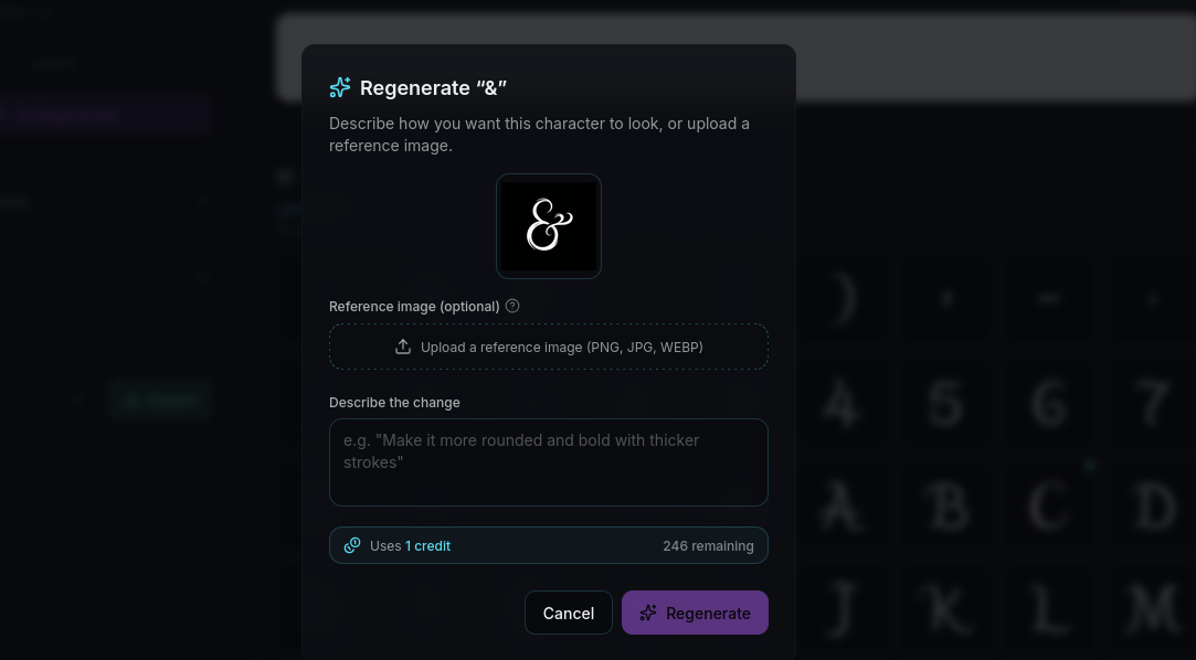
How per-glyph regeneration works
Open any font in Font Studio, find the glyph you want to change, and click on it. The regeneration panel opens with three things:
- A text prompt field where you can describe what you want, in plain language. 'Make the descender straighter' or 'match the geometry of the uppercase letters' or 'add more weight to the curves' all work.
- A reference image upload. Drop in a photo, sketch, screenshot, or a clean image of how the letter should look. The model uses it as a hard visual target, not just creative inspiration.
- An 'apply to variants' toggle. If you fix the lowercase 'o', it can also refresh ò, ó, ô, ö, õ, ø in the same pass, keeping your accented characters in sync with your edit.
The regeneration runs in the background, takes about fifteen seconds for a single glyph, and produces a new version that sits alongside the previous version in the version picker. Nothing destructive happens. If you don't like the new attempt, you switch back to the old one with a click. If you like it, you keep it.
The rest of the font stays exactly where it was. The 174 other characters you already loved are not touched.
Why the reference image matters
Text prompts alone are surprisingly limited for fixing individual letters. 'Match the style of the rest of the font' is the most common thing people want to say, and it is also the hardest thing for a model to do well, because the model doesn't have a clean view of 'the rest of the font' as a coherent style direction.
A reference image solves this directly. Upload a photo of the letterform you want, or a screenshot of a similar font you're using as a north star, or a quick pen-and-paper sketch of the letter shape. The model uses your reference as a hard visual target, and the output respects the geometry, weight, and contrast of the reference far more reliably than any text description could.
This matters most for fonts that started from a hand-lettered reference. If your original font was generated from a photo of your handwriting, the easiest way to fix a misbehaving glyph is to draw that single letter again on paper, photograph it, and upload it as the reference. Two minutes of pen and paper, ten seconds of regeneration, and the broken letter is back in the family.
The variants trick
Font Studio knows that letters live in families. When you fix the uppercase 'O', the lowercase 'o' usually wants the same treatment. When you fix the unaccented 'a', all the variants that depend on it (à, á, â, ä, ã, å) want to inherit those changes too.
The 'apply to variants' toggle does this in one regeneration pass. The base glyph gets the new shape, and every variant that shares the underlying letterform gets refreshed to match, with diacritics applied on top. For multilingual fonts that span 81 Latin-script languages, this means a single fix can repair an entire branch of the character set at once.
There is a credit cost difference, of course. A single-glyph regeneration costs less than fixing all variants in a pass. But for the cases where your edit is structural, like fixing the proportions of a letterform that propagates everywhere, the variants pass is dramatically faster than fixing each diacritic version one at a time.
What this changes
For people who generate fonts on Lipi.ai, the workflow is now:
- Generate the font.
- Browse the result in Font Studio.
- For any letter that didn't land, fix it directly. With a prompt, with a reference image, or both.
- Ship the font.
There is no regeneration roulette. The good letters stay good. The bad letters get fixed, and only the bad letters get touched.
This is a small change in product surface and a large change in what is actually possible. Generating a font that is 95% great and 5% broken used to be the same problem as generating a broken font, because you couldn't keep the 95% while fixing the 5%. Now you can.
If you have an existing font in your dashboard that you abandoned because of a few bad letters, this is the moment to open it back up. The fix that wasn't possible last month takes about twenty seconds today.
Open Font Studio from your dashboard, pick the font, and click the letter you want to change. The rest is straightforward.